A complete redesign of Think Future Technologies company website to give it a modern, clean, and professional look. The goal was to improve the visual experience, reflect the brand’s personality, and make key content easily accessible. This project focused on attracting both potential clients and young job seekers through a responsive and trust-building design. The entire site was redesigned from scratch using the TFT brand palette and optimized for both desktop and mobile users.
Prototype Link
Web Version-: Design Link
Mobile Version-: Design Link

Overview
What was the project about?
The project was focused on redesigning the company website for Think Future Technologies (TFT) from scratch. The goal was to give the site a modern and visually appealing look while aligning it with the company’s brand identity. We aimed to make the website more engaging for two key audiences: potential clients looking for IT services, and young job seekers especially college graduates exploring job opportunities at TFT.
Why was the redesign needed?
The old website looked outdated and lacked character. It resembled a basic WordPress template with little customization. While it worked, the visuals felt flat, especially on inner pages with repetitive layouts and cluttered content. It didn’t reflect the values or innovation of a modern tech company or offer an engaging user experience.
The redesign aimed to fix these issues with a fresh, modern look that creates a strong first impression, builds trust, and positions TFT as a premium IT services brand.
What were the core objectives & goals?
🎯 Stakeholder Goals:
Apply TFT’s brand palette to deliver a modern visual design
Ensure fast load times
Build fully responsive layouts
Create scalable structures to support future content growth
🔍 My Core Objectives:
Design a modern site using brand colors to appeal to clients and younger talent
Craft a homepage that builds trust and makes a strong first impression
Position TFT as a innovative, reliable tech brand
Ensure mobile-friendliness across all devices
Highlight clear, accessible CTAs to boost engagement
Use consistent layouts and reusable components for easier development
Present key information upfront to improve content discoverability
👷♂️ My Role
As the UI/UX designer, I led the complete redesign of the company website. I began by aligning on project goals, reviewing the old site, and mapping user flows. Using Adobe XD, I designed scalable, responsive layouts with a consistent visual style and added Lottie animations for a modern touch. I focused on reusable components and kept the design developer-friendly, while regular check-ins helped maintain alignment across teams.
My contributions at each phase: 👀
Discovery & Planning: Analyzed the old site, gathered stakeholder input, and mapped page flows
Wireframing: Created low-fidelity layouts to define structure and hierarchy
Visual Design: Designed high-fidelity UI screens with brand-aligned visuals
Interaction Design: Added Lottie animations for a polished, dynamic feel
Design Handoff: Delivered clean, scalable components for development
Collaboration: Joined reviews and discussions to keep everyone aligned
Process
🔍 Research & Audit
Before jumping into design, I spent time understanding what wasn’t working on the existing website and what expectations the team had for the new one. While there was no formal analytics or behavioral data shared with me, I relied on visual review, team discussions, and reference research to shape the direction of the redesign.
📃 Reviewing the Old Website
The existing site felt outdated, especially on inner pages with repetitive layouts and scattered content. It was functional but lacked visual appeal and didn’t reflect the premium image the company aimed for.
🔎 Informal Competitive Research
Before receiving team references, I reviewed websites of other IT service companies to study layout structure and design patterns. This helped me set a clear benchmark. I later aligned my direction with references shared by the PM and team.
👥 Team Inputs Instead of Formal Interviews
Instead of structured interviews, I had ongoing discussions with the project manager and team members. These helped me clarify goals and make informed decisions on layout, trust-building elements, and content hierarchy.
✏️ Wireframes
I began with rough low-fidelity wireframes on paper to explore layout ideas quickly without focusing on details. The goal was to map structure, content flow, and user movement across the site.
For inspiration, I referred to over 20 modern websites saved in my Adobe XD files, including examples from Awwwards and ReFerro. I also used UI-Patterns.com to study effective UX patterns. This research helped me design clean, user-friendly layouts suited for both desktop and mobile.
UX exploration and layout ideation
https://hunter-healthcare.com/
https://histoire.orange.com/en/history-of-telecoms/history/


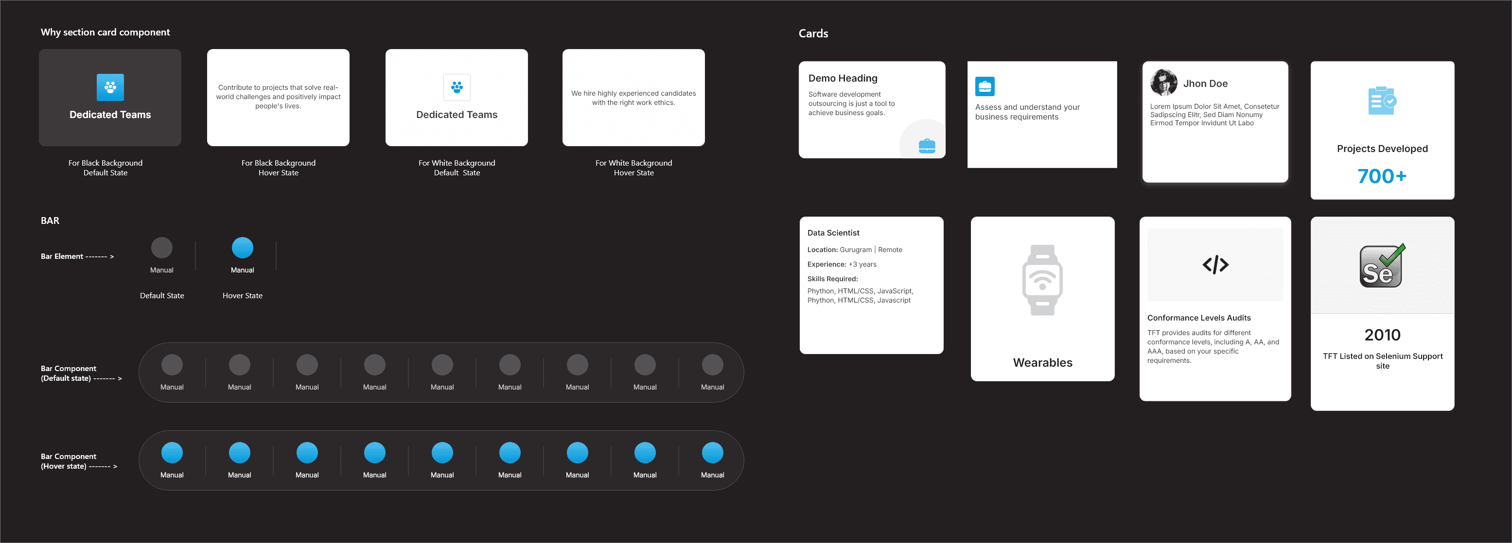
🎨 Design System
For the final UI designs, I created over 20+ screens covering all key pages including the homepage, about, services, careers, contact, and more. The aim was to build a consistent and clean visual style that felt modern while aligning closely with TFT's brand identity.

I maintained visual consistency and brand alignment across the website by using TFT’s official brand color palette strategically. The deep blue (#0099DB), which is part of their core brand colors, was primarily applied to CTA buttons and for visual accents like glows, shapes, and highlights—helping draw attention to key interactive elements.
For the overall layout, I used black (#231F20) for hero sections to create strong visual impact, and white (#FFFFFF) as the dominant background color throughout the remaining sections of the site. This created a clean, structured look while allowing the branded accents to stand out effectively.
🔠 Typography System

For typography, I used the Inter font family for its simplicity, readability, and versatility across headings, body text, and CTAs. The type scale was designed to maintain a clear visual hierarchy while staying clean and uncluttered.
🧩 Component System
While working on the designs, I focused on creating reusable components like buttons, card blocks, testimonial sections, and navigation headers. This helped maintain consistency across pages and made the handoff to developers smoother, reducing the need for rework or clarification later.


🧪Prototyping & Testing
Once the main designs were ready, I created an interactive prototype to walk through the full website experience. This helped in sharing a clear vision with the team. Feedback was mostly shared through review calls, where we made a few small adjustments to layouts, content placement, and spacing based on internal inputs.
🔁 Before & After
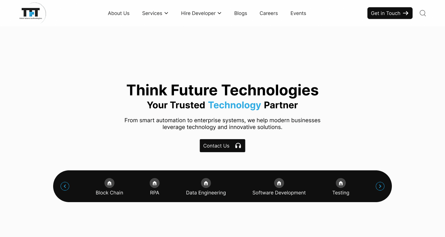
🏠 Homepage
Before
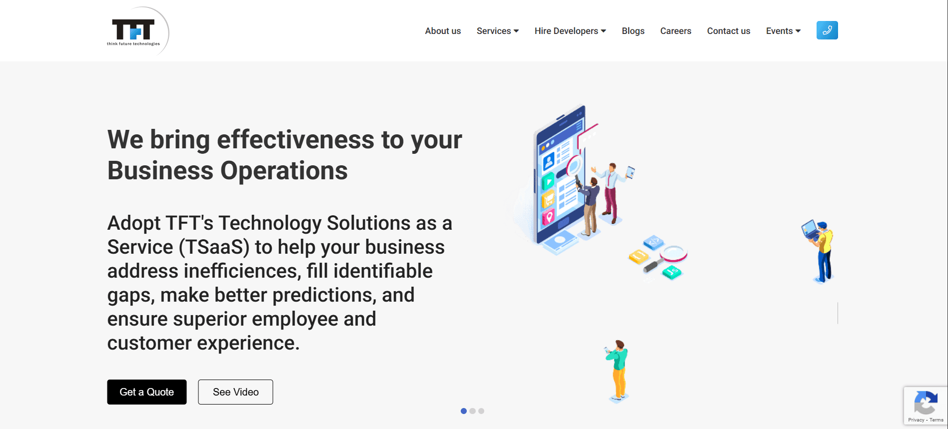
Weak visual identity and generic layout
Overwhelming paragraph text without clear message
Low visual hierarchy for headings and CTAs
After
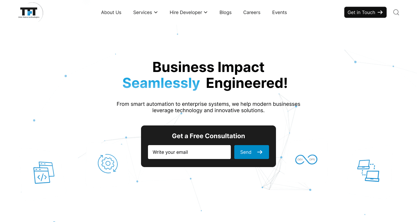
Strong headline and benefit-focused bullet points
Bold visual hierarchy guiding user attention
Prominent “Contact Us” CTA and embedded form
Displayed trust badges (ISO, CMMI) to boost confidence
Improved branding with a darker theme and tech-style visuals
🧩 Services Page
Before
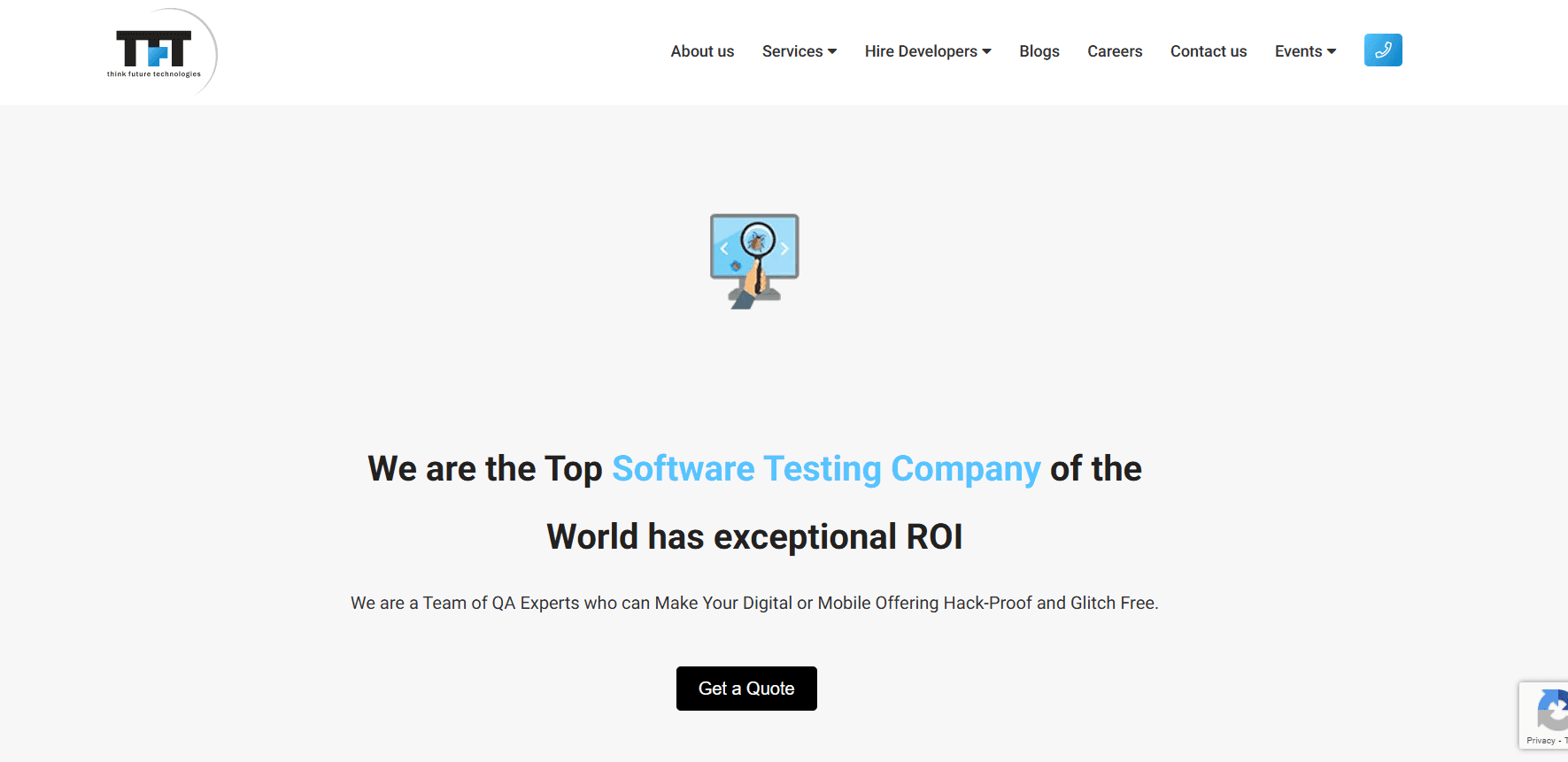
Hero section lacked visual depth and felt disconnected from the brand.
Poor visual hierarchy made it hard to identify key information quickly.
CTA ("Get a Quote") was small and easily overlooked.
The image/icon felt generic and did not represent the service offering.
No clear segmentation of service types (manual, automation, etc.).
After
Hero section uses bold typography and brand colors to immediately capture attention.
Strong headline and subtext clearly communicate value proposition.
CTA ("Contact Us") is prominently placed and visually appealing.
Subtle background patterns add visual richness without distraction.
Introduced service carousel that showcases all testing services in a clean, scannable format.
🧑💼 Contact
Before
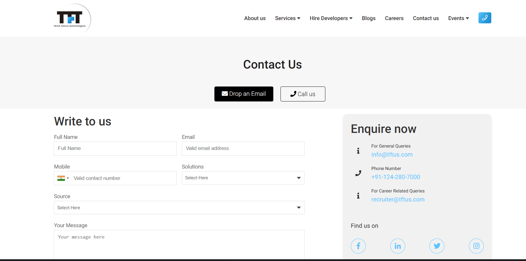
Cluttered layout with separate "Write to us" and "Enquire now" sections, causing confusion for users.
Inconsistent button styles ("Drop an Email" and "Call us" buttons lack uniformity and modern design).
Minimal visual hierarchy, making it hard to prioritize key actions like submitting a query.
Lack of a clear call-to-action or submit button, relying only on email and call options.
Overly plain design with no branding elements or engaging visuals.
After
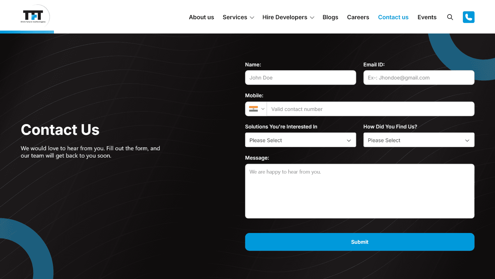
Streamlined single-form layout with a cohesive design, reducing confusion and improving usability.
Modernized button design with a prominent "Submit" button in blue, enhancing call-to-action visibility.
Improved visual hierarchy with bold "Contact Us" heading and better spacing for readability.
Added branding elements like circular patterns and a darker theme, making it more engaging and professional.
Included a welcoming message ("We would love to hear from you") to encourage user interaction.
🏢 Navigation
Before
Text-heavy layout with no visual separation between categories, making it hard to scan quickly.
Lack of icons or color coding, reducing visual interest and hierarchy.
No interactive or engaging elements to draw user attention.
Poor alignment and spacing, leading to a cluttered and unprofessional appearance.
Limited branding integration, with only a small logo and no thematic consistency.
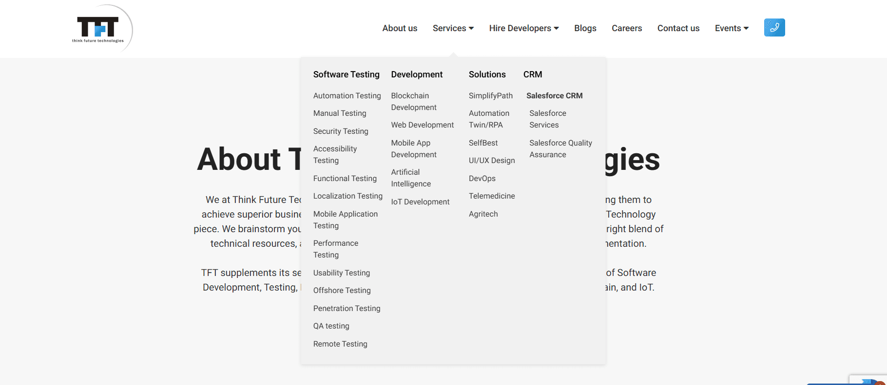
After
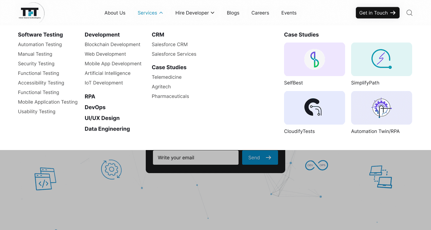
Introduced visual separation with colored blocks and icons for each category, improving scannability.
Added modern icons and a darker theme with accents, enhancing visual appeal and hierarchy.
Included interactive card-like elements for better user engagement.
Improved alignment and spacing for a cleaner, more professional look.
Enhanced branding with circular patterns and a cohesive color scheme.
⚠️ Note:
While only a selection of five pages is showcased here to highlight key improvements, several other pages were also redesigned as part of the overall project. These followed similar visual and UX enhancements for consistency, usability, and improved user engagement.
📈 Impact
The redesigned website was created with a clear focus on improving user experience, visual consistency, and clarity across all touchpoints. Every design choice from layout structure to typography and color was made to enhance engagement and create a smoother journey for both potential clients and job seekers.
While the outcomes of these improvements may reflect over time, the updated design now provides a strong foundation for future growth, better content delivery, and a more trustworthy digital presence for the brand.
🚧 Challenges & Learnings
1. Development Handoff Gaps
While my core role focused on design, a few visual and functional inconsistencies emerged during the development phase.
✅ How I handled it: I performed a design-vs-build audit and coordinated directly with developers to resolve key issues, ensuring UX consistency.
🔁 Next time: I’d incorporate structured design specs and early collaborative reviews with devs to minimize discrepancies.
2. Late Content Delivery & Delayed Feedback
Some delays in receiving page content and stakeholder feedback affected the overall design flow and project momentum.
✅ How I handled it: I adjusted the workflow to prioritize reusable components and designed flexible page templates so progress could continue while awaiting content.
🔁 Next time: I’d propose a shared content and feedback calendar to improve visibility and ensure better alignment on dependencies.
3. Feedback Was Mostly Verbal - Handled with Permission
Much of the stakeholder feedback was shared during verbal calls, making it harder to track over time.
✅ How I handled it: With the stakeholder’s permission, I recorded key discussions and revisited them while iterating. I then shared summarized notes for confirmation to maintain alignment.
🔁 Next time: I’d set a shared system for asynchronous written feedback and meeting recaps to improve traceability and reduce ambiguity.
✅ Conclusion
Final Reflections on the Project 🌟
This project gave me a well-rounded opportunity to design a real-world, scalable solution while closely collaborating with stakeholders and cross-functional teams. Although it came with its share of constraints, I learned to stay flexible and make decisions that balanced user needs, timelines, and available content.
How This Project Helped Me Grow as a Designer 🌱
It pushed me to become more proactive in handling communication gaps, managing shifting requirements, and create adaptable design systems. I also developed a habit of documenting feedback and advocating for clarity during stakeholder discussions something that’s helped me improve collaboration in later projects.
What I’m Proud Of 😊
I’m proud of how I maintained consistency and quality across the entire website, despite the content and feedback delays. I also take pride in my ability to adapt the workflow to keep the project moving and in delivering a clean, usable design that aligned with the business goals.

